Faradays
Services
Branding / UX/UI / Social Media
Client
Faradays
Year
2024
Faradays is an events and hospitality brand dedicated to turning moments into masterpieces.
Based in Melbourne, the brand creates bespoke experiences that blend luxury, atmosphere, and personality, from intimate private gatherings to high-profile corporate events. Faradays approached us with the goal of elevating their brand to better reflect the level of experience they create. The identity needed to feel refined and timeless, while still capturing the energy, movement, and emotion of live events. Rather than positioning Faradays as just an events service, the ambition was to frame it as a curator of atmosphere, where every detail contributes to a memorable experience.
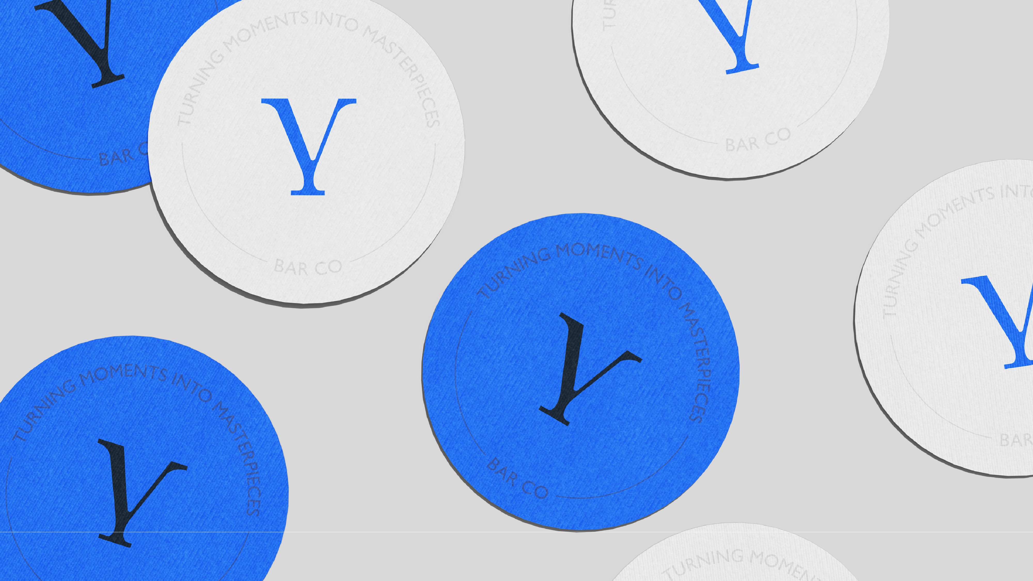
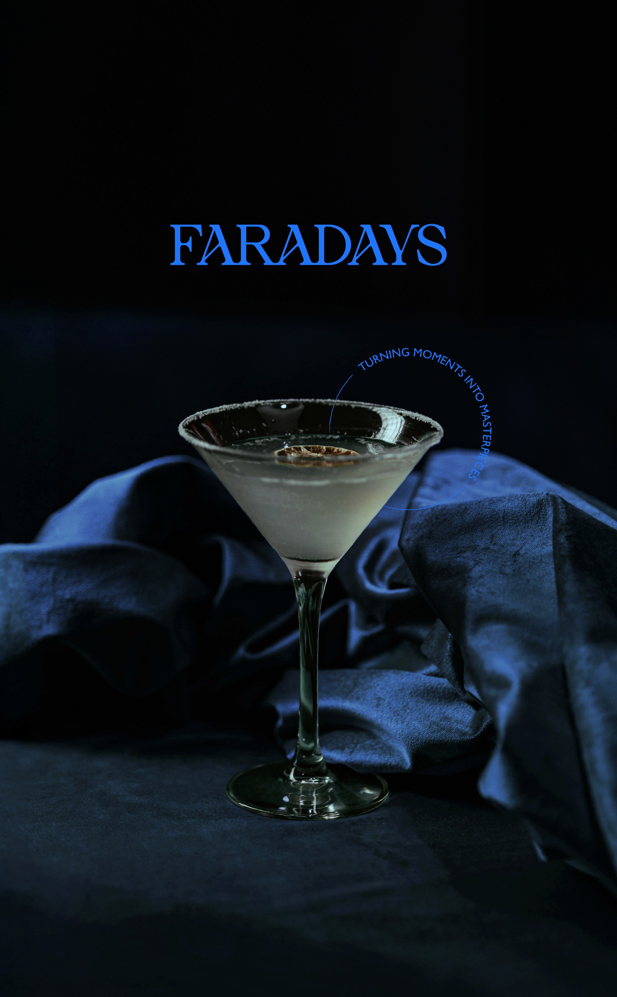
The logotype incorporates the silhouette of a cocktail glass within the letter Y, creating a distinctive and recognisable mark. This simple gesture gives the logo its unique character while remaining refined and intentional.
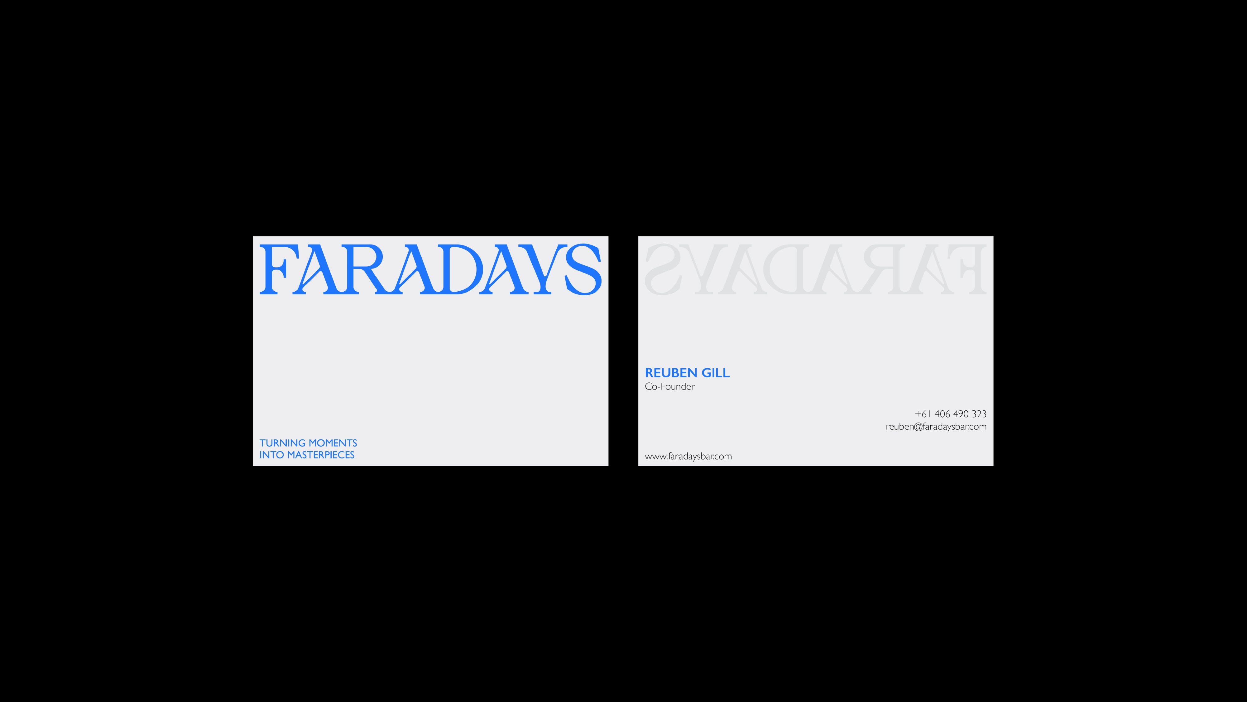
By transforming the Y into a symbol, the identity gains a strong secondary element that subtly references Faradays’ world of hospitality and events. Rooted in a clear and considered idea, the logo balances modernity with a sense of timelessness. This symbol is then extended across the wider identity, functioning as both an icon and a seal. Applied to elements such as coasters, business cards, and printed collateral, it creates a cohesive and versatile visual language across digital and physical touchpoints.
The visual system is built around contrast and rhythm, mirroring the interplay between night and light that defines many of Faradays’ events. At its core sits a custom typographic identity: elegant yet expressive, with dynamic diagonal cuts that introduce movement and tension. The logotype balances classic proportions with contemporary details, allowing it to feel confident, distinctive, and adaptable across both formal and playful contexts. Subtle graphic elements, including the cocktail glass motif integrated into the letterform, add character without undermining sophistication.

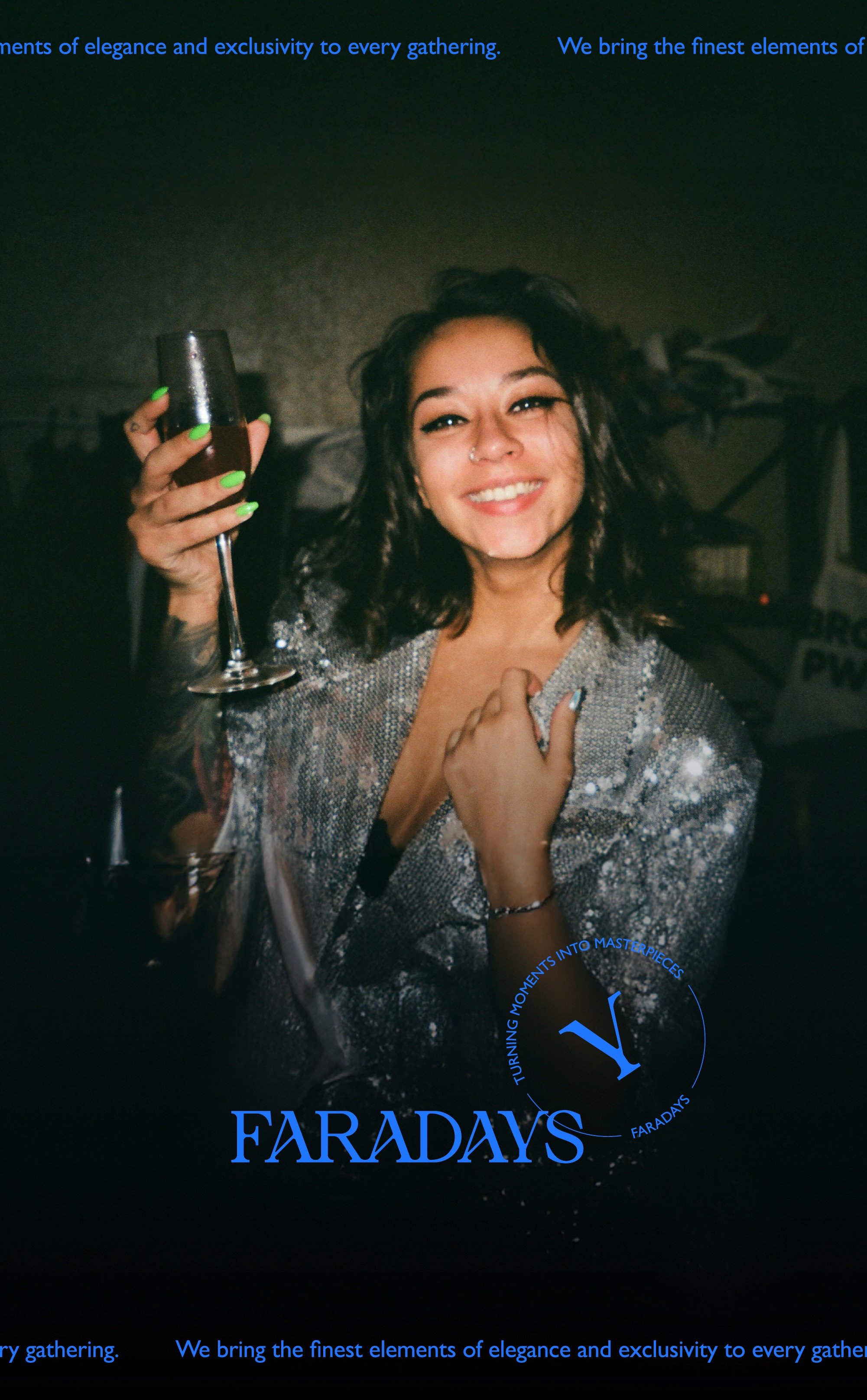
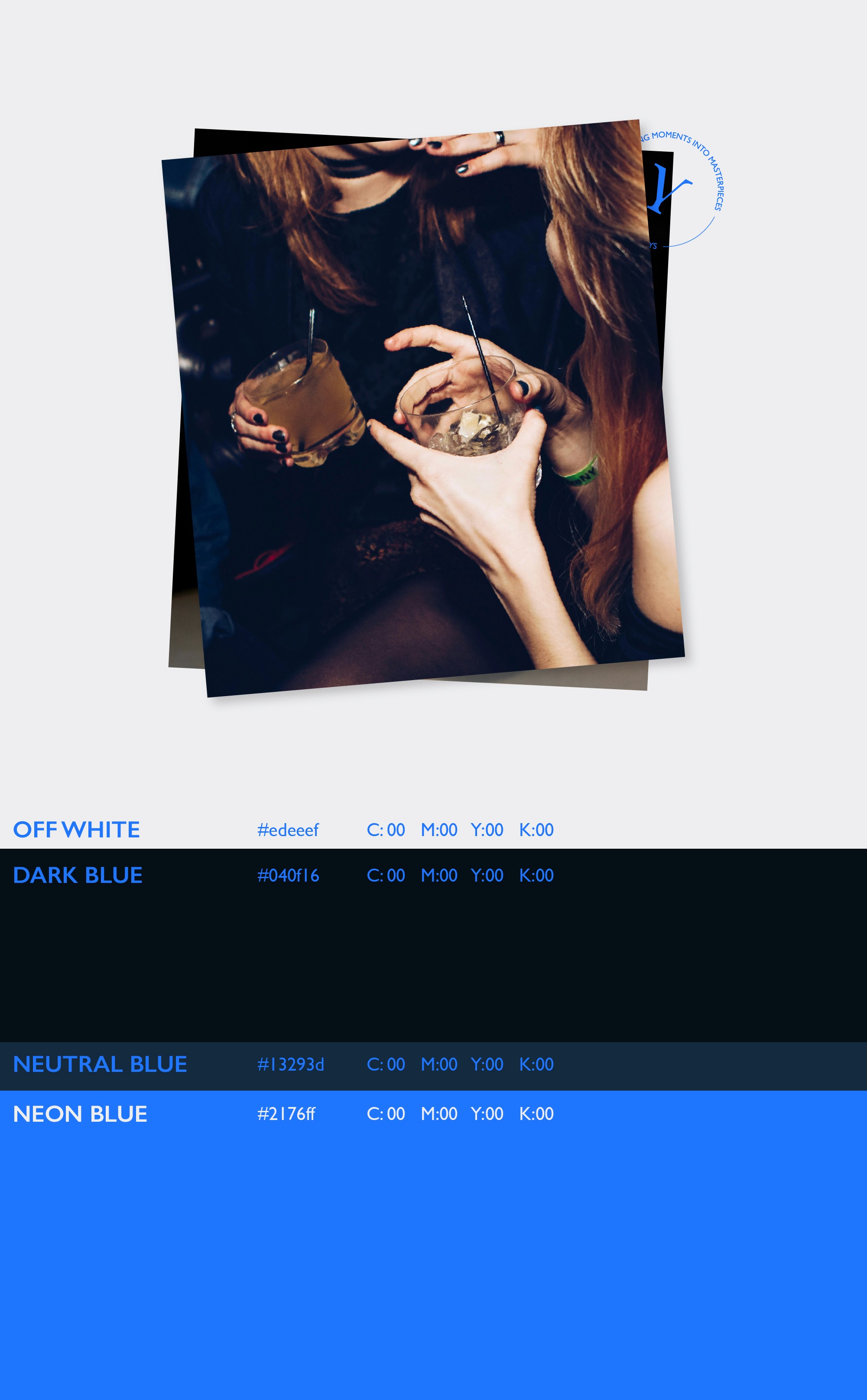
This system is supported by a restrained color palette of deep blues, black, and white, accented with a vibrant electric blue to introduce freshness and energy. Photography plays a central role, capturing real moments, emotion, and interaction, while typography and layout provide structure and clarity. Together, these elements form a flexible identity that can shift seamlessly from print to digital, from understated elegance to bold celebration, reinforcing Faradays’ promise of bespoke, elevated experiences.
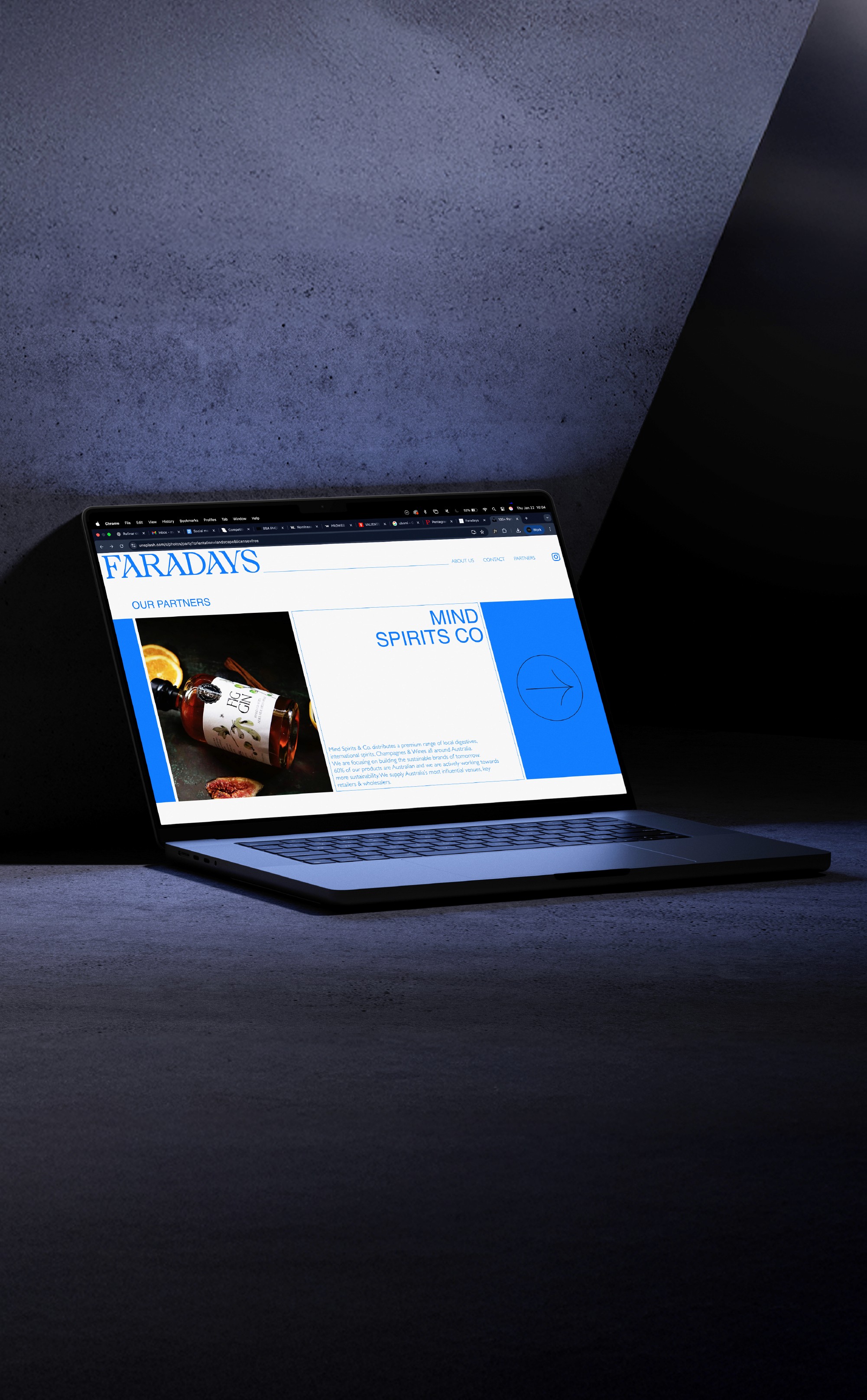
The website and social media presence play a crucial role within the identity, extending the brand with the same sense of strength and elegance found in the core visual system. The website was designed as a key platform to showcase Faradays’ events, requiring a balance between dynamism and refinement to reflect both atmosphere and professionalism.
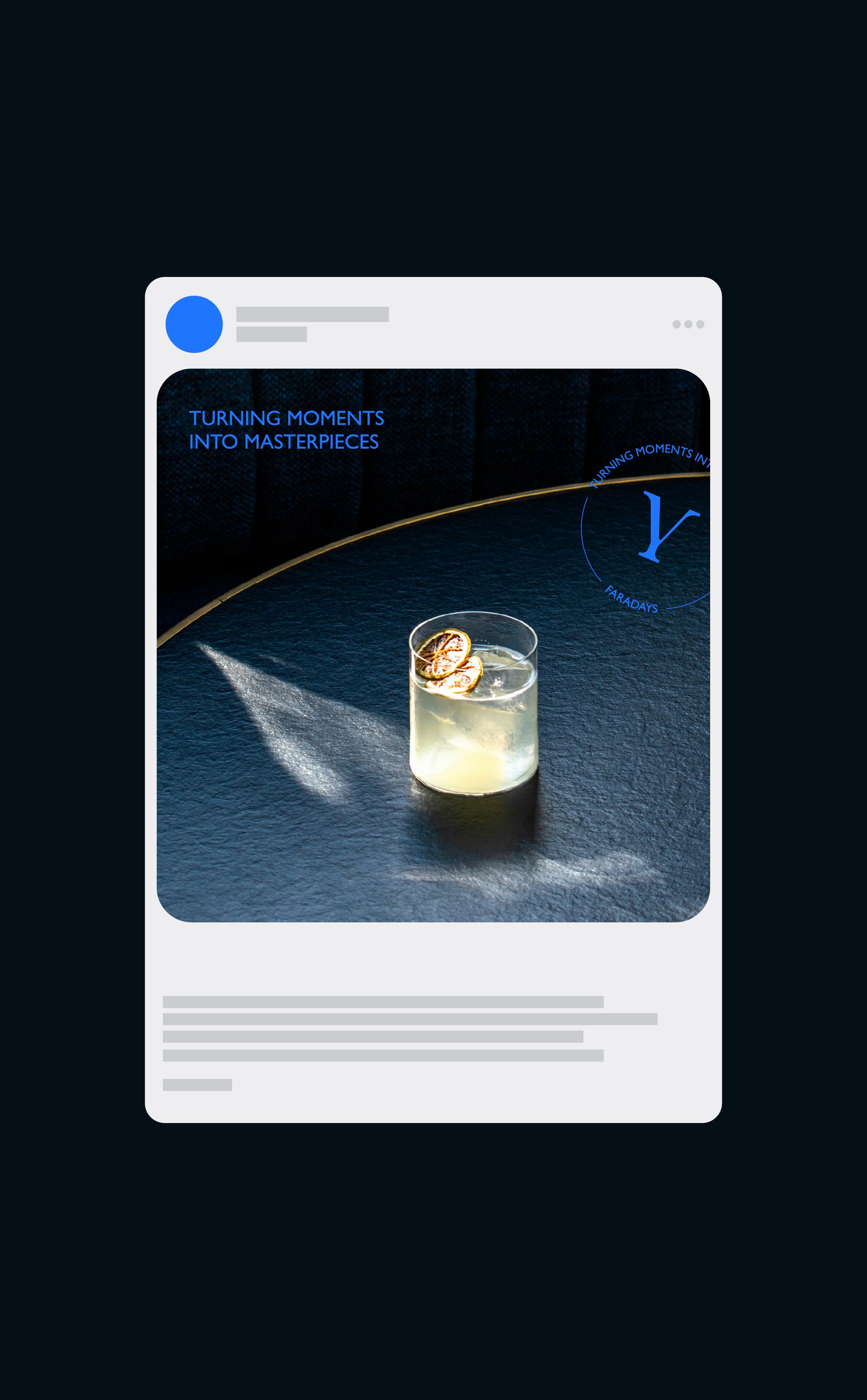
Social media was approached with the same level of care. The way events and photography are presented is central to how the brand is perceived, making consistency essential across every touchpoint. Through considered layouts, typographic hierarchy, and image treatment, the identity remains cohesive and recognisable while adapting fluidly across digital platforms.
