
Services
Industry
Year
Brief / Overview
The client is a corporate advisory investment bank. The firm specialises in capital raisings and transactions for businesses in the consumer sector: personal care, fashion, beauty, hair care, body care, fragrance. Its clients are companies whose worth lives largely in their brand value rather than in physical assets, and whose financing needs require advisors who understand brand-led businesses from the inside.
The firm operates on a deliberately small scale. Fewer clients than the larger advisory houses, more partner attention per engagement, a relationship-based model that rejects the volume strategy. The brand needed to read at the same tier as the historical European banking houses (Rothschild, Greenhill, Ohana) without imitating them, and to signal depth on first encounter to clients who would not extend a second look to a firm that read as new.


Strategy
The firm launched as a new entrant in a category where trust is calibrated by lineage. Its clients are mostly older, more established companies in the consumer sector that need corporate advisory work from a partner they can trust. The challenge was a particular kind of credibility gap: how do you make a new firm read as a firm clients have always known about?
The studio's strategic move was to position the brand inside an older intellectual lineage entirely. Not the lineage of modern finance, which is recent and reads as new-money in design terms, but the lineage of European intellectual tradition. The studio took the Renaissance as the reference: the period that built the modern book, codified perspective, separated light and shadow into design tools, and placed humanism at the centre of intellectual work. The brand reads inside that lineage, with type, palette, and graphic discipline drawn from the rules the period invented.
The decision propagates through every element. The Renaissance is treated as design infrastructure, not as a visual theme. Renaissance rules become the brand's design rules: the structural grid, the contrast between light and shadow, the discipline of restraint. The brand reads inside the intellectual tradition rather than borrowing from it visually.


Design
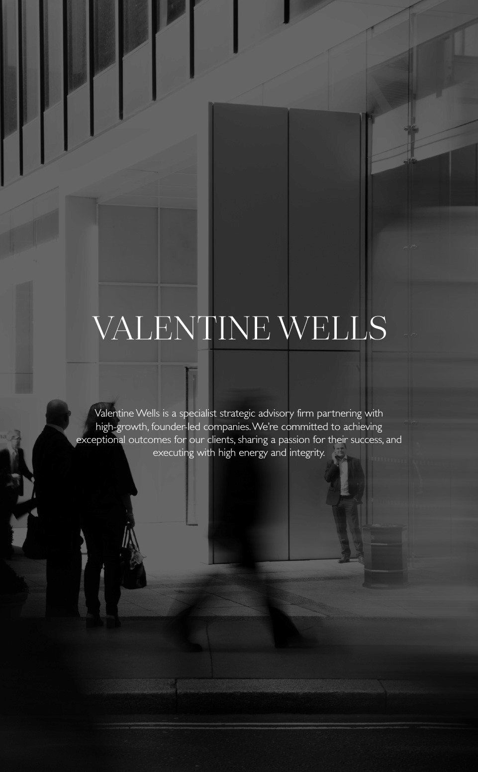
The wordmark is set in a high-contrast transitional serif. The choice places the brand inside the visual lineage of historical European banking houses, where transitional serifs have been used continuously since the eighteenth century. A reader who has seen Coutts or Rothschild does not consciously identify the lineage, but the brand reads at the same tier on first glance.
The palette holds at black and white with a single restrained accent. Light and shadow are the Renaissance's contribution to the brand's colour discipline: contrast as composition, restraint as confidence. No additional colour is invited in.
The grid that organises every document is the brand's underlying infrastructure. Drawn from the structural grids of early printed books, the grid runs through letterheads, pitch decks, contracts, financial models, business cards, and the brand's website. One grid across all of them, calibrated for each format but never replaced.
The Renaissance illustration that appears in the identity is licensed historical artwork, properly attributed to its source collection. The brand uses the image as a visual link to the intellectual tradition it positions itself inside, not as a graphic ornament. The illustration is the work of the period that named the period; the brand sits alongside it rather than borrowing from it.


Applications
The application library is the brand's commercial surface. The pitch deck template is the firm's commercial engine: every event the firm participates in starts with a deck the studio designed, every client meeting starts with a document the brand designs. Letterheads, contracts, term sheets, investor letters, and business plans run on the same grid and typographic system, scaled to format but never broken across formats.
The website is the brand's first impression. It opens on the wordmark, sits the Renaissance illustration at the right scale, and lets the typography and the grid do the work that a younger-firm brand would try to do through more visual elements. The business cards are the brand's hand-to-hand introduction, set in the same transitional serif, with the Mayfair address as the credit line.
Every application is calibrated to its specific moment in a relationship. The pitch deck arrives before a contract is signed; the term sheet during negotiation; the business card at the meeting itself; the website at the moment a potential client is first researching the firm. The brand's discipline holds across the entire arc of the engagement.


Result
What the design achieved was a brand that reads at the level of the firm's older competitors without imitating them. The identity appears in the typographic register of the historical European banking houses, sits inside the intellectual lineage of the Renaissance, and operates with the document discipline that lineage produced. A reader encountering the brand for the first time reads centuries of design lineage before reading the firm's date of founding.
The firm is in active engagements, with the pitch deck winning meetings and the grid holding across every document the firm produces. The brand performs the work it was designed to do: signalling depth to clients who calibrate trust by lineage.
The brand reads as if it has been here for centuries.
