Services
Industry
Year
Brief / Overview
The Joe is coffee you eat. One bite, one coffee, twenty grams in a sachet.
The product had no category to sit in. Nothing on a shelf looks like a coffee bite, so the packet has to introduce the format and the brand at the same time, in the two seconds before someone decides whether to pick it up.
The brief was an identity and the packaging system that would carry it. Not a logo and a set of wrappers: a complete visual language, and a structure able to hold the whole product range, the retail box, and the applications needed to sell the product into a shop.
One condition shaped every decision inside it. The packaging system had to carry collaborations from the first day. Roasters and established coffee brands would put their own coffee inside the product and their own name on the outside of it, so the system had to work just as well at the point it was no longer being used by The Joe.
Strategy
Finding the right icon was the whole job. The wrapper does the introducing, and it does all of it or none of it gets done.
The obvious icon was wrong. The bean is what every coffee brand reaches for, which makes it the least distinguishing image in the category, and printed on a wrapper it names the input rather than the thing in your hand. It also fails the specific problem here. A brown bar in a wrapper with a bean on it reads as chocolate, and once someone has filed a product in the wrong category they do not come back to check.
What Melbourne's coffee culture holds in common is not the bean. It is the cup. The takeaway cup is the shared object of the city, the thing in every second hand at eight in the morning, and as an icon it delivers coffee before the eye has finished crossing it.
A cup on a wrapper is not a chocolate bar. The disambiguation happens before reading, which is the only place it can happen at retail.

Design
The cup does every job in the system. It is the logotype and the standalone mark, the pattern running across the packaging and the boxes, the marker on each product in the range, and the shape of the bar itself.
Underneath it the packaging runs on a fixed information architecture. Every pack puts the same things in the same places: the wordmark and the flavour, the proposition, the weight, the nutritional panel, the seal. What changes from one product to the next is the colour, the name and the numbers. Nothing else moves.
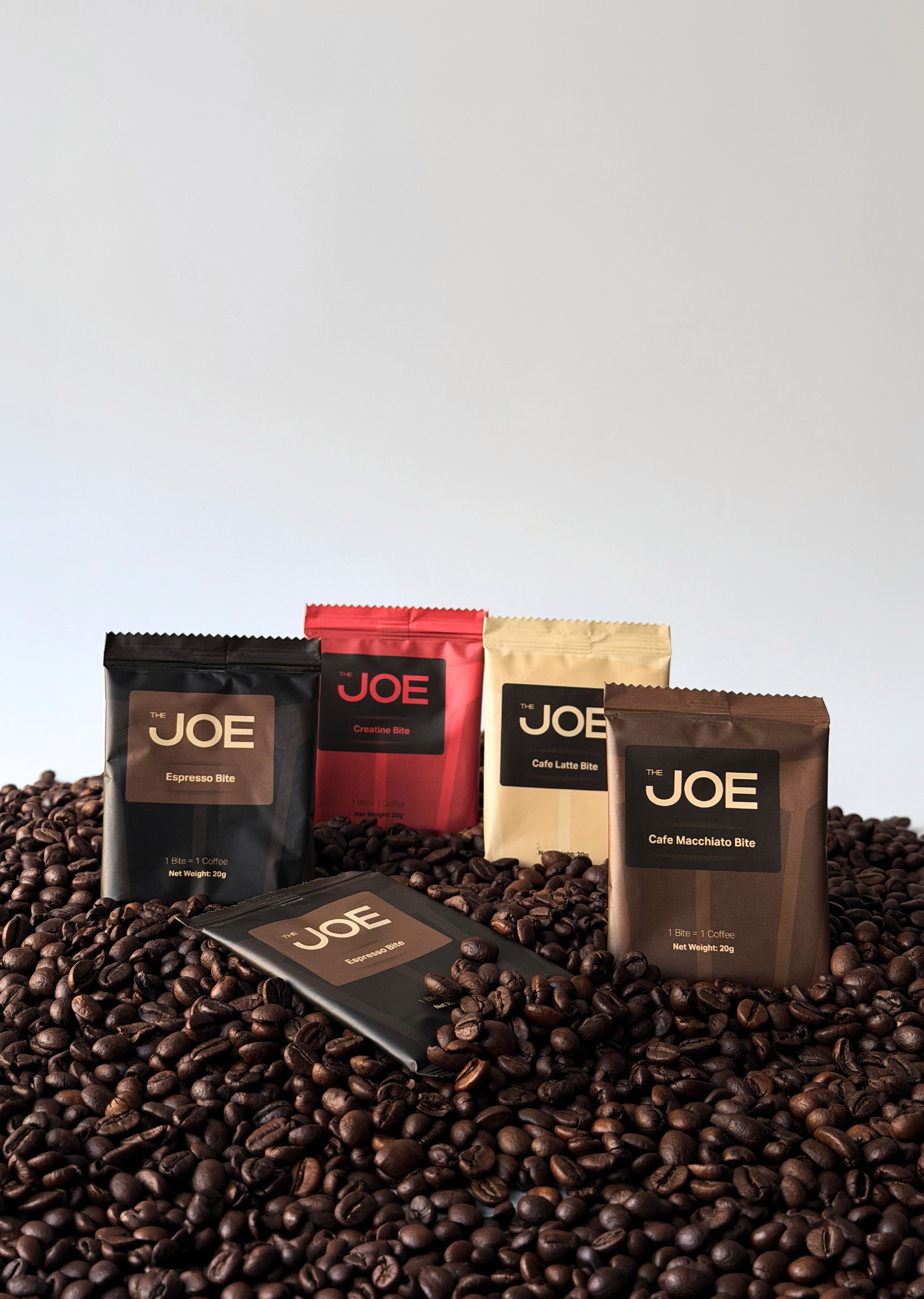
Colour is doing two jobs at once. It mimics the drink, so the latte pack is pale and the espresso pack is close to black, and it separates the range on a shelf, so a customer finds the one they came for without reading a word. Descriptive and navigational in the same decision.
That architecture is also what makes the system shareable. In a collaboration the front of the pack can be given away entirely, a partner's colours, their design, their logo, while the back of the pack and the shape of the bar stay exactly as they are.


Applications
The system was built out into the artefacts the product ships with. Sachets across the flavour range, the retail box, business cards, email signatures, and the presentation materials used to sell the product into stockists.
The dieline is where the architecture becomes real. Unfolded, one surface has to carry the pattern, the cup strip, the product information and the seal, and resolve them in the order a hand meets them. It is also the file that has to survive production, so the studio supplied the measurements and the final print-ready assets rather than a visual for somebody else to rebuild.
The small print does more work than its size suggests. 1 Bite = 1 Coffee sits on the front of every sachet and states the whole proposition in three words. The seal reads open the packet and enjoy, an instruction written as a stamp, which is how a product in an unfamiliar format earns a first purchase without a paragraph of explanation.


Result
The Joe launched with a system rather than a logo and a packet. Packaging across the range, the retail box, business cards, email signatures, and the materials used to sell the product into stockists, all built from one element.
Collaborations have run through it since without the identity being redesigned once, which was the brief rather than a bonus. The variable was always colour, and the colour was never decoration.
And where a partner's name goes on the wrapper, the bar keeps the brand in the room. The identity can be lent out without being spent.


